Create one separate Rubber Stamp Travel Field Notes Poster for each uploaded photo. Output each photo individually. Never create a collage or combine multiple photos.
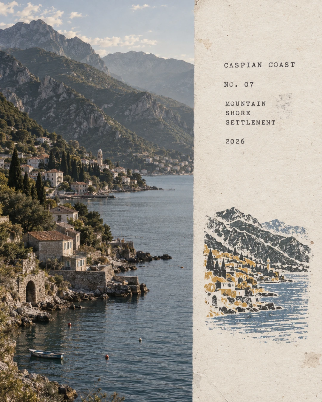
Use a 4:5 canvas with a left and right visual organization, without drawing an obvious dividing line. The left region should occupy about 58 percent of the frame and faithfully preserve the original photo. Maintain the main subject identity, terrain, architecture, plants, people, spatial relationships, natural lighting, shadows, authentic textures, and original color atmosphere. Apply only restrained art publication level photo color grading and extremely subtle fine grain film noise. Natural cropping is allowed only to adapt the layout. Do not stretch, distort, shift, replace, or redraw the main subject.
The right region should occupy about 42 percent of the frame and use warm off white aged paper as its background. The paper should have subtle fibers, natural grain, light usage marks, and a matte texture. Preserve large areas of unprinted paper whitespace and make the blank space an essential part of the composition.
Analyze the original photo and extract only the most location distinctive subject outlines, architectural structures, terrain contours, plant forms, roads, shorelines, or key visual relationships. Compress them into a small multi color rubber stamp image. Do not replicate every element from the photo. Retain only the minimum information needed to recognize the original location, subject, and scene relationships. Remove crowds, vehicles, dense windows, repetitive buildings, fragmented vegetation, decorative elements, and irrelevant backgrounds.
For iconic architecture, retain the most distinctive outer contours, roofs, domes, arches, towers, or main structures. For mountain settlements, compress buildings into a few terraced color blocks aligned with the terrain. For coastal scenery, retain mountain contours, settlement layers, shorelines, and sparse water ripples. For city panoramas, retain the main skyline, one iconic building, and one or two layers of distant mountains. For natural landscapes, retain primary mountain forms, trees, shorelines, or road orientations. If foreground occlusions are narratively important, retain them as foreground stamp outlines.
Place the stamp in the lower middle of the right paper region. It should occupy only about 30 percent to 38 percent of the right region’s height, with generous whitespace around it. Do not enlarge the stamp into a standard illustration, full landscape painting, or brand logo.
Extract 2 to 4 spot inks from the original photo. Prefer desaturated colors such as carbon black, deep green, brick red, ochre yellow, slate blue, or taupe brown, but do not force a fixed palette. Preserve the most distinctive color character of the original photo and use only a small area of color for emphasis.
Render every color as a separate hand stamped layer with authentic rubber stamp carving texture, hand engraved marks, uneven line widths, contour notches, fractured edges, dry ink shortages, paper show through, granular ink, uneven pressure, partial ghosting, and subtle misregistration of about 1 to 2 mm. Allow natural misalignment between color layers. Do not digitally smooth the edges. The print must resemble a real carved stamp pressed onto aged paper, not a filtered photo, smooth vector illustration, or line art logo.
Replace the bracketed fields with accurate values inferred from the photo or supplied by the user. Place the following text below or beside the stamp in the whitespace:
[LOCATION ENGLISH NAME]
NO. [NUMBER]
[KEYWORD 1] [KEYWORD 2] [KEYWORD 3]
[YEAR]
Use a small, restrained typewriter font with slightly mechanically imperfect forms. The typography should feel like a traveler’s field record created by an architect, travel writer, or natural observer, not an advertising headline. Spell every word accurately. Set [YEAR] to 2026 by default unless another Gregorian year is supplied. Do not add irrelevant slogans, brands, or decorative copy.
The overall mood should be quiet, restrained, tactile, regionally specific, handmade, and collectible. The original photo should represent the on site record, while the stamp should capture the most recognizable fragments of memory.
Avoid obvious central dividing lines, circular seals, Chinese red stamps, postage stamp perforations, wax seals, sticker collages, tourist souvenir templates, smooth vector logos, generic city icons, full replication of all architecture, dense detailing, childlike craftiness, cartoon style, 3D rendering, plastic textures, glossy gradients, oversaturation, excessive text, decorative clutter, and any redrawing or alteration of the original photo on the left side.










نقد و بررسیها
هیچ دیدگاهی برای این محصول نوشته نشده است.